ChurnZero
App
Project
ChurnZero is a customer success software that helps businesses understand customer’s product usage, health and more to improve the customer experience. The project was part of a conceptual exercise assigned by the company to re-envision the company’s most used area of the app, the To-Do List.
Description
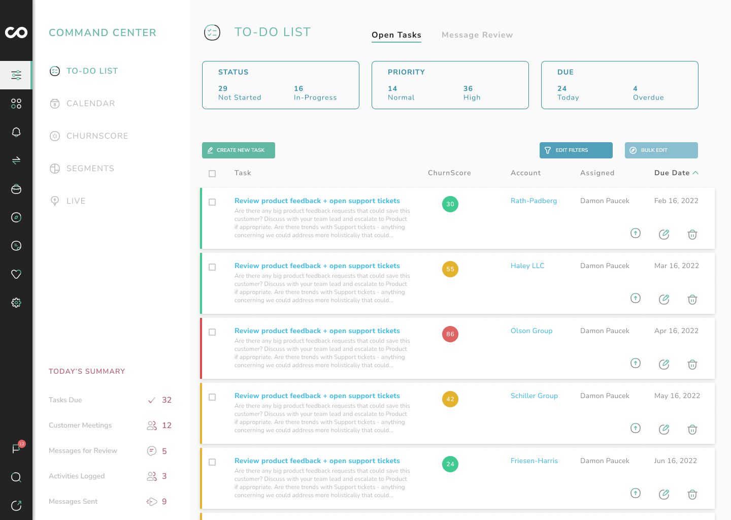
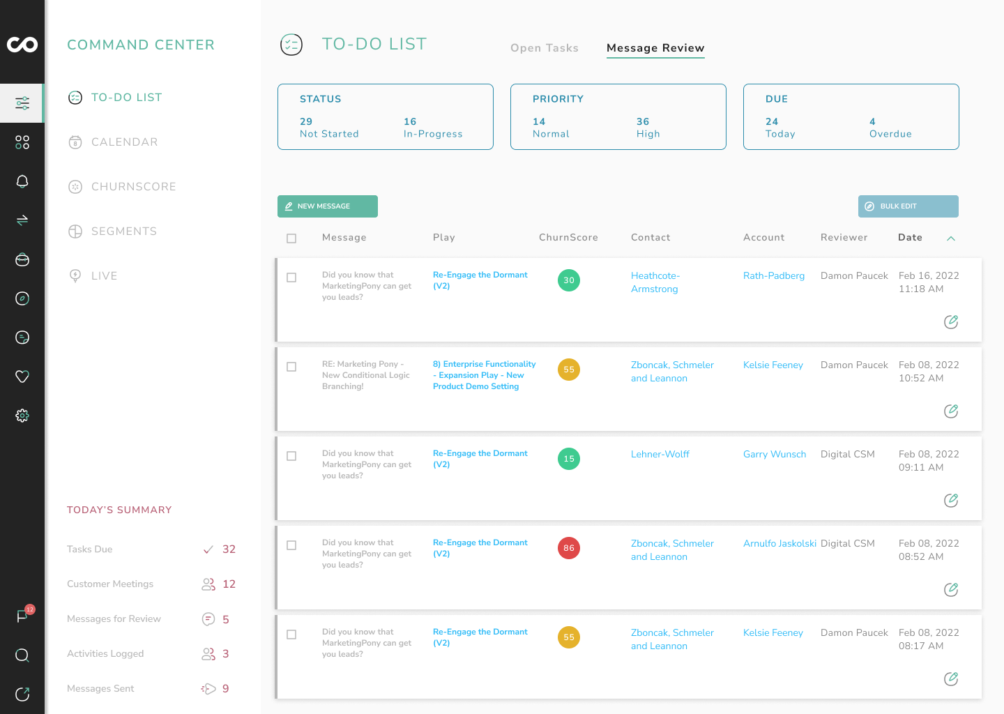
My main goal was to tackle the dense amount of information presented in the current version of the To-Do list feature, and to re-prioritize the information displayed in order to streamline the user’s primary interactions with the page.
1. Today’s Summary
The persistent summary cards at the top of the page only provided top level information and no actionable interaction within the page. I chose to move this into the new sub-navigation as that information stayed the same between the Tasks and Messages tab. The information is also relevant to all other sub-menu items, so housing it in the navigation area creates consistency.
2. Tabs
The sub-tabs were functionally okay in their original positioning on the page. However, in order to declutter the main content area and to move static information that distracted from the primary to-do function of the page, I moved the tabs as menu items in the new sub-navigation.
3. Open Tasks Charts
These charts somewhat enhance the overall feel of the page by providing some visualization to the information, but ultimately the presentation in the pie chart format doesn’t solve any user problems or bring meaningful insight to the data. This was consquently turned into a more straightforward module showing the data in a simplified way while reducing the amount of page real estate taken.
4. To-Do Tasks
Perhaps the most meaningful change to the page, the To-Do list itself has been re-imagined into a a new design that’s purpose is to enhance scanability and create greater delineation between the listed tasks. This will in turn make interacting with the task list more efficient and easer to read.


